From design to development, I've strived to become a precious asset for the companies and clients I've worked with. After almost ten years of working in several creative roles for a wide variety of businesses, I've picked up skills, competencies, and a passion for seeing concepts grow from a simple idea to a fully-fledged product.
Below, I've listed some of the work I've done over the past years that I'm truly proud of, detailing all the highs and lows of each project.
If you have any questions or want to chat about any of it, give me a shout at scotthewitson@live.co.uk
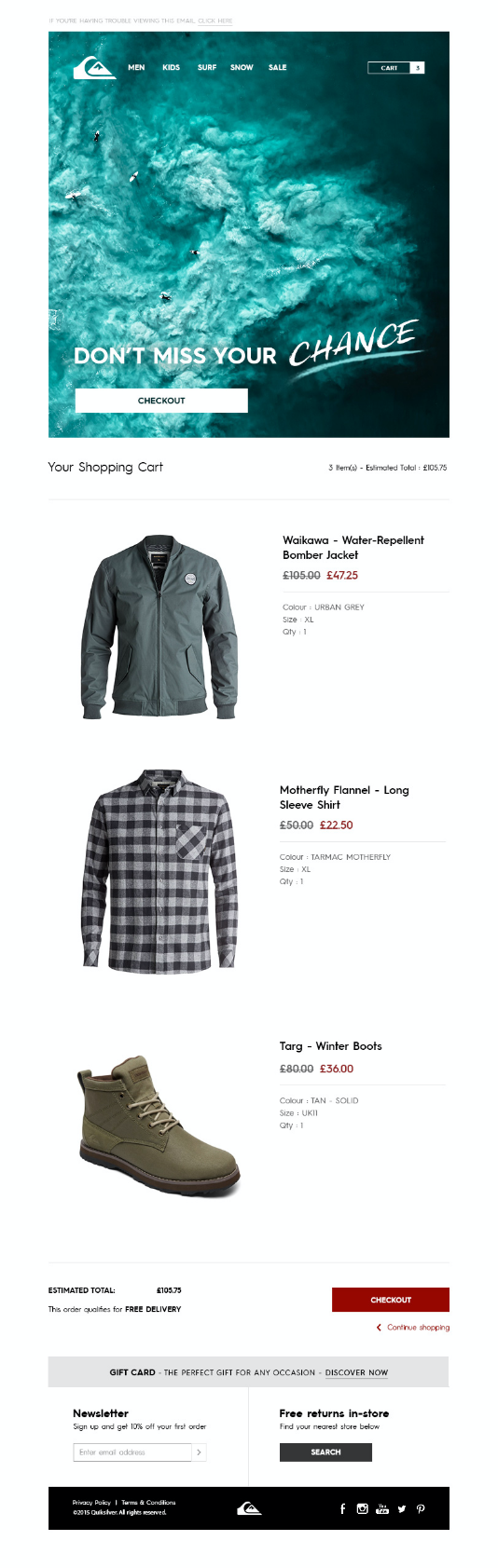
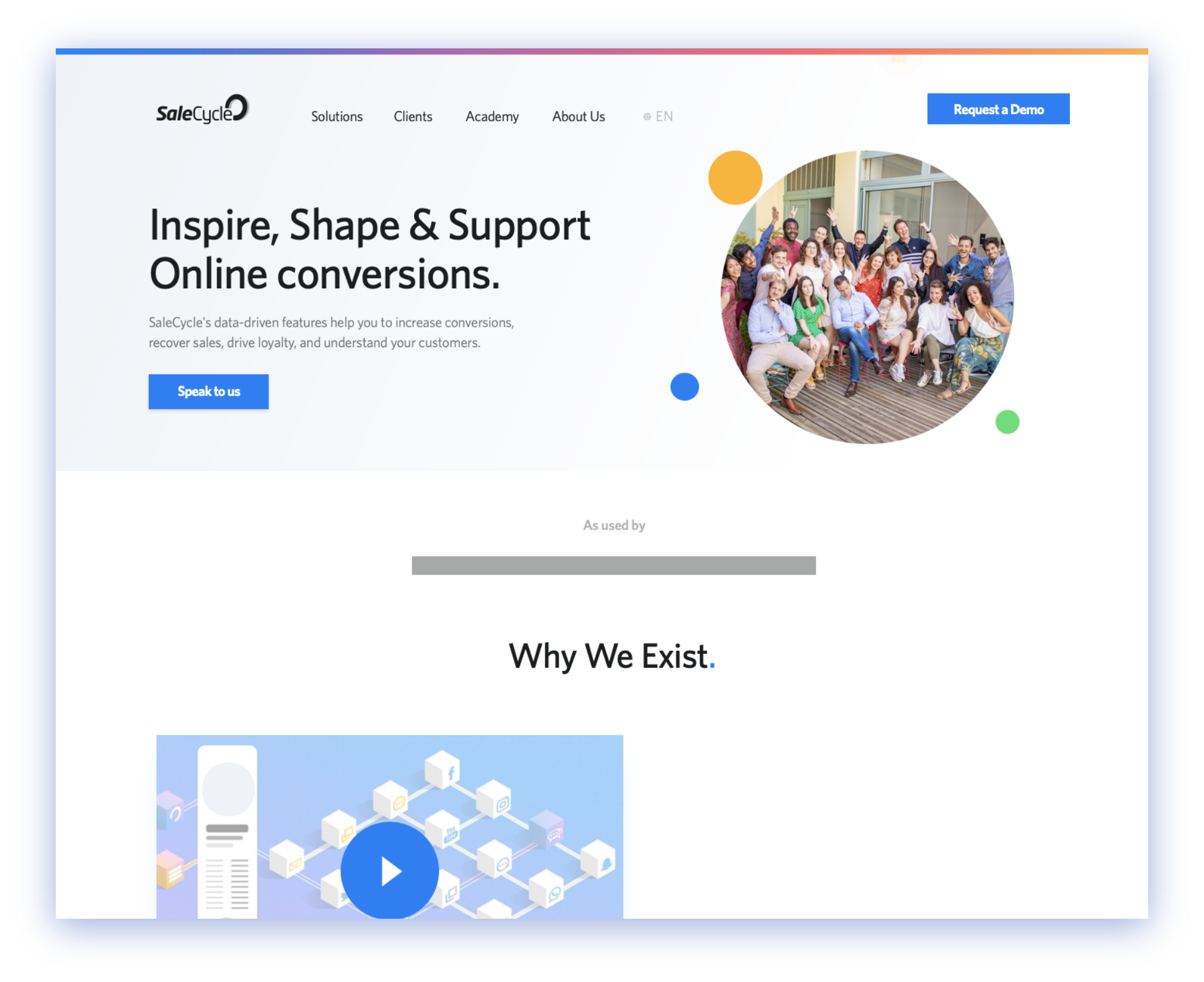
'Finally, I get to kill my predecessor's website design', I thought to myself. It was the project I'd dreamed about and the next stage in the eternal battle between Matt (best friend, ex SaleCycle Web Marketing Manager, nemesis) and I.
I figured it was simple enough, you just design it in Sketch
and then build it using Bootstrap. And that's where the trouble began...
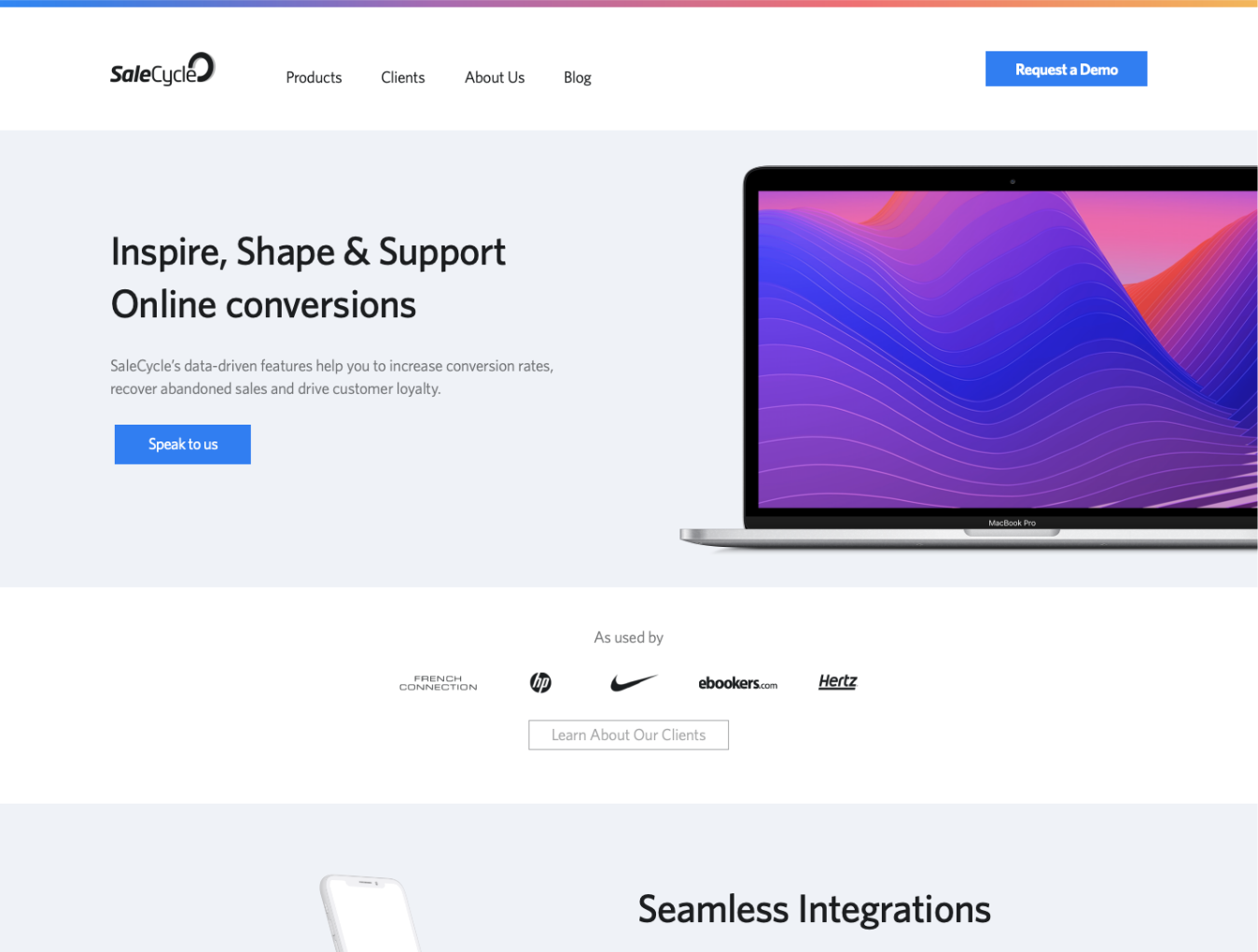
The site, as it stood, was functional, explained what SaleCycle did as a business and gave in-depth technical knowledge into each product we sell.
It also loaded in a whopping 19 seconds average, gave away our product's inner workings to competitors, and worst of all, had a gradient background straight out of 2016.
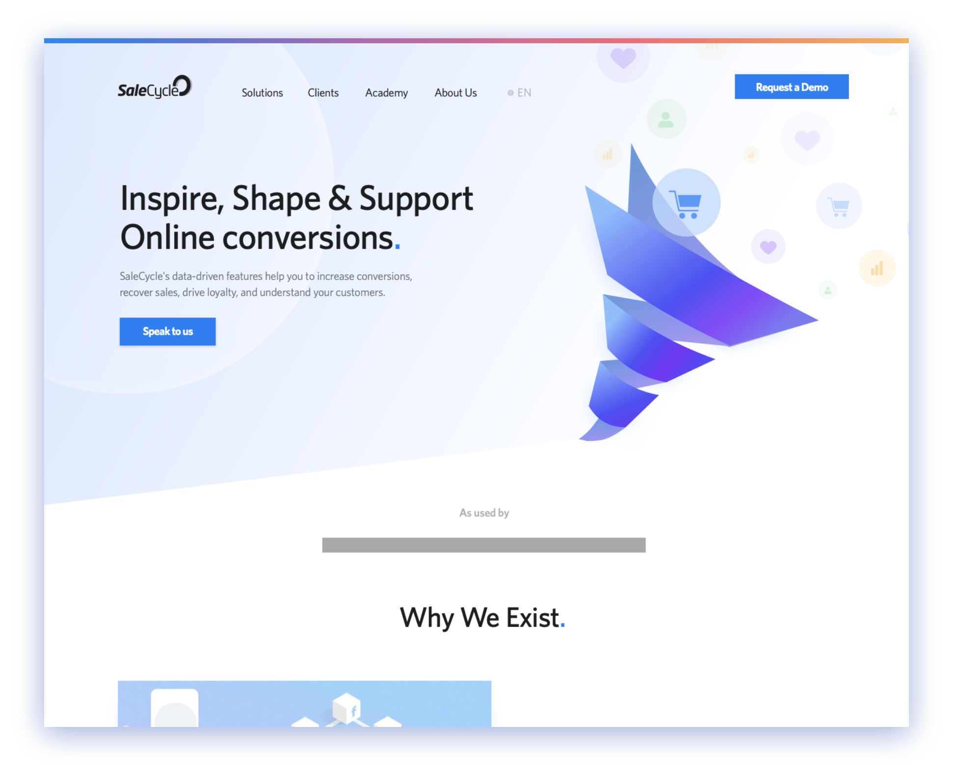
As the web marketing manager, and as a designer, I had to think of a way to bring our company's visuals to 2019 while keeping in mind that KPIs are a thing (which for Marketing is Inbound Demo requests). So I began developing ideas with that in mind, which is mistake one.
Just putting demo buttons around pretty illustrations and images which don't make sense doesn't mean your stakeholders will be happy. In my situation, my stakeholder was the CEO of the company I'd been working at for 2 years on the bottom rung of the corporate ladder. A CEO who I'd literally never spoken to and knew nothing about other than 'He's a designer too'.
So when the time came to show him my wonderful designs, I'd already failed in my objective by not understanding what he wanted in the first place.
But that's not to say I wasted my time.
In fact, by showing him all of the wrong in my designs, I
discovered what was right in them. And this path of discovery
meant I could refine these ideas and create something that hit
the mark.
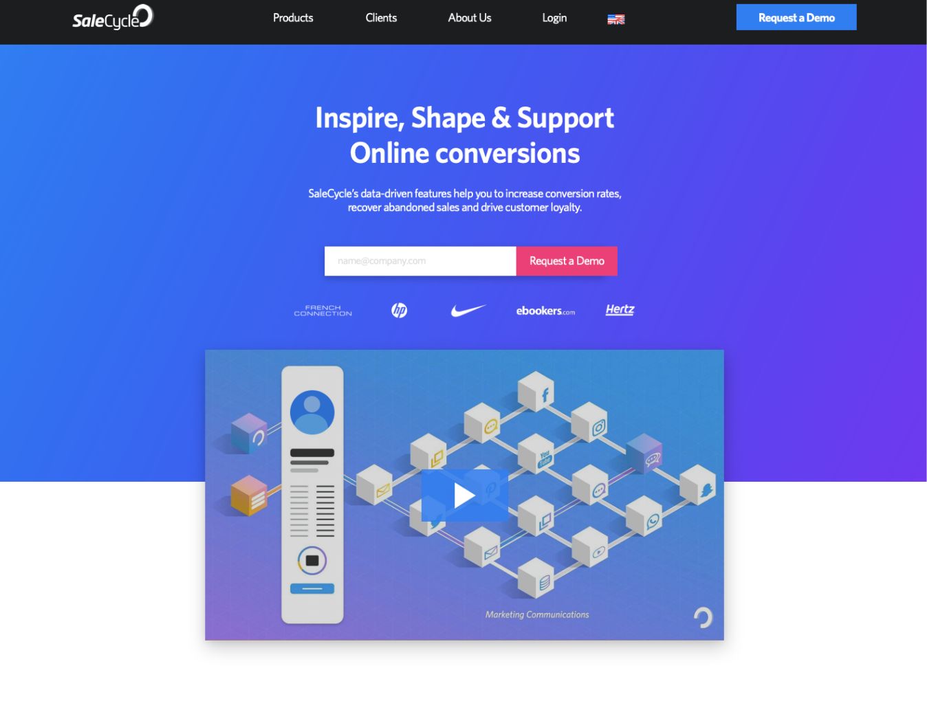
Using this feedback session, as well as meeting with other
key members of staff, it became obvious the company
favoured a less cluttered, tell-all, minified aesthetic. And for
that to happen, a brand 'refresh' was needed.
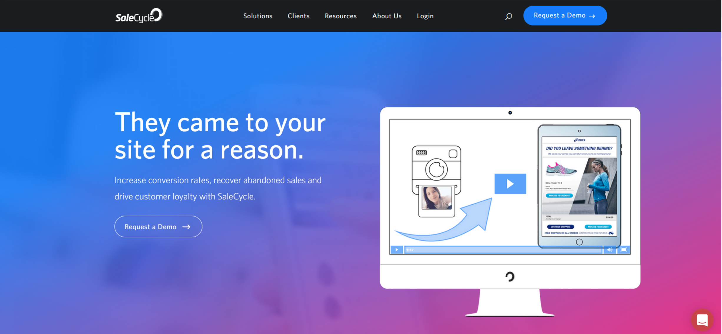
I was given the all clear to approach the site without the restrictions of a strict brand guideline and given only the instruction to not change the logo or the primary blue colour. With each design, I incorporated elements of each iteration that I hypothesised would have the most impact on the website's KPIs, while researching design trends and competitors to ensure we'd have a website that looked cutting edge.
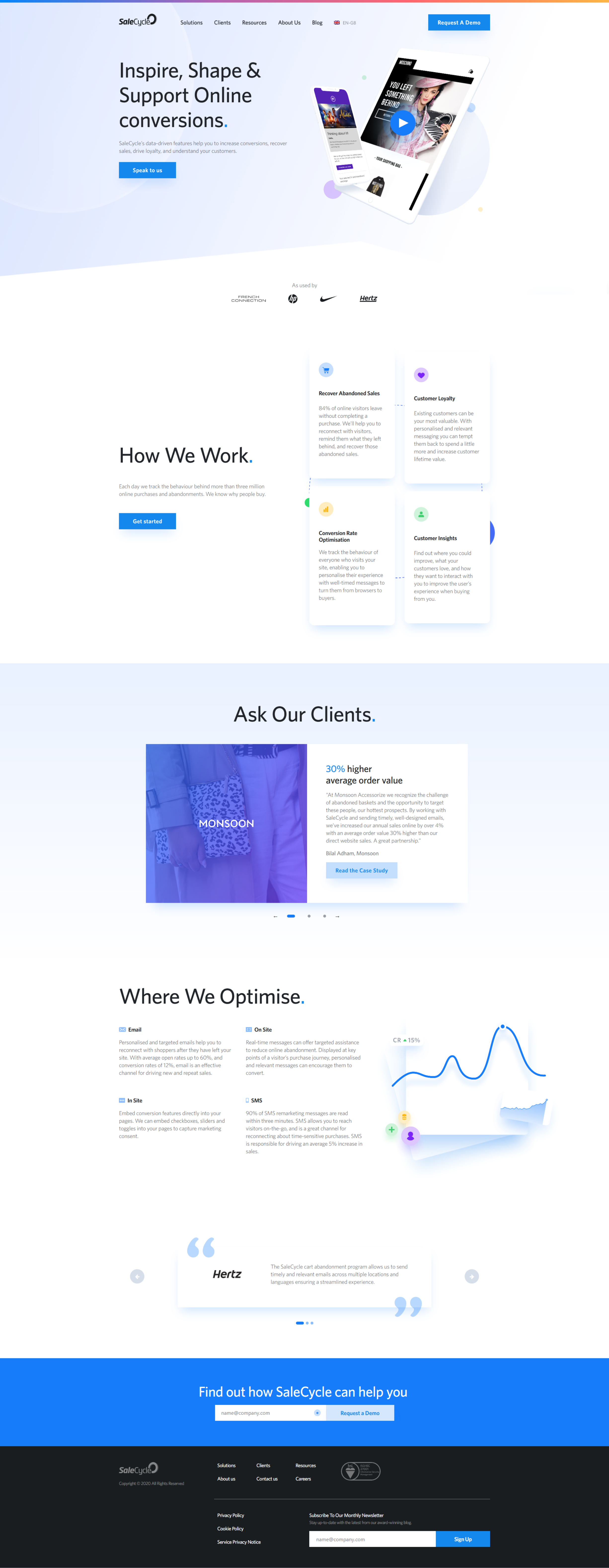
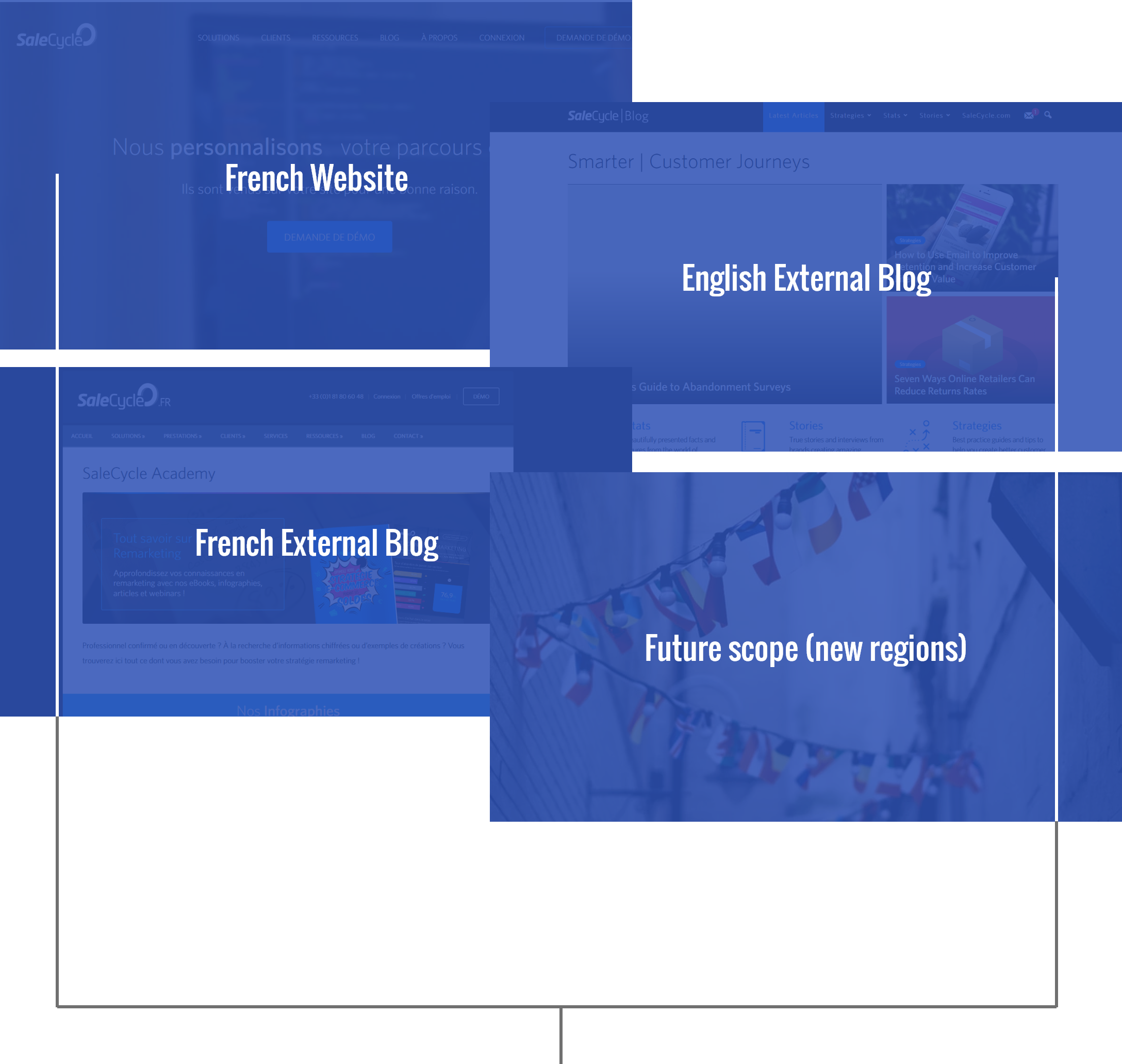
Once a design had been settled on, the task of building the site became the main goal. What had originally been a simple redesign of a single site quickly found itself becoming a singular outreach for all of SaleCycle's online presence. Pulling in alternative languages, regions and external sites, as well as leave scope to introduce new regions meant that the build turned into a monolith of a platform.
Knowing already the scope of what I was tasked with
achieving, I knew I needed a framework that was structured in
such a way that I can make any change deployable efficiently
the entire site, while taking into account any possible effect it
could have on the styling, SEO, content and functionality of
each pillar of the new site.
I also needed to consider the skillset of my company and
department, and provide something that would be usable in a
situation where I was no longer present or unable to action a
task that was set.
The decision was reached to begin building using Wordpress,
which was a platform my team were already familiar with, and
I set out to research potential starting points. I already knew I
wanted complete and total control over the site's theme and
functionality, so the idea of building on a premade template,
with added bloat from unused functions wasn't something I
would take lightly.
With that in mind, I found a midpoint between accessibility
and control by building using UnderStrap as a theme
dependency.
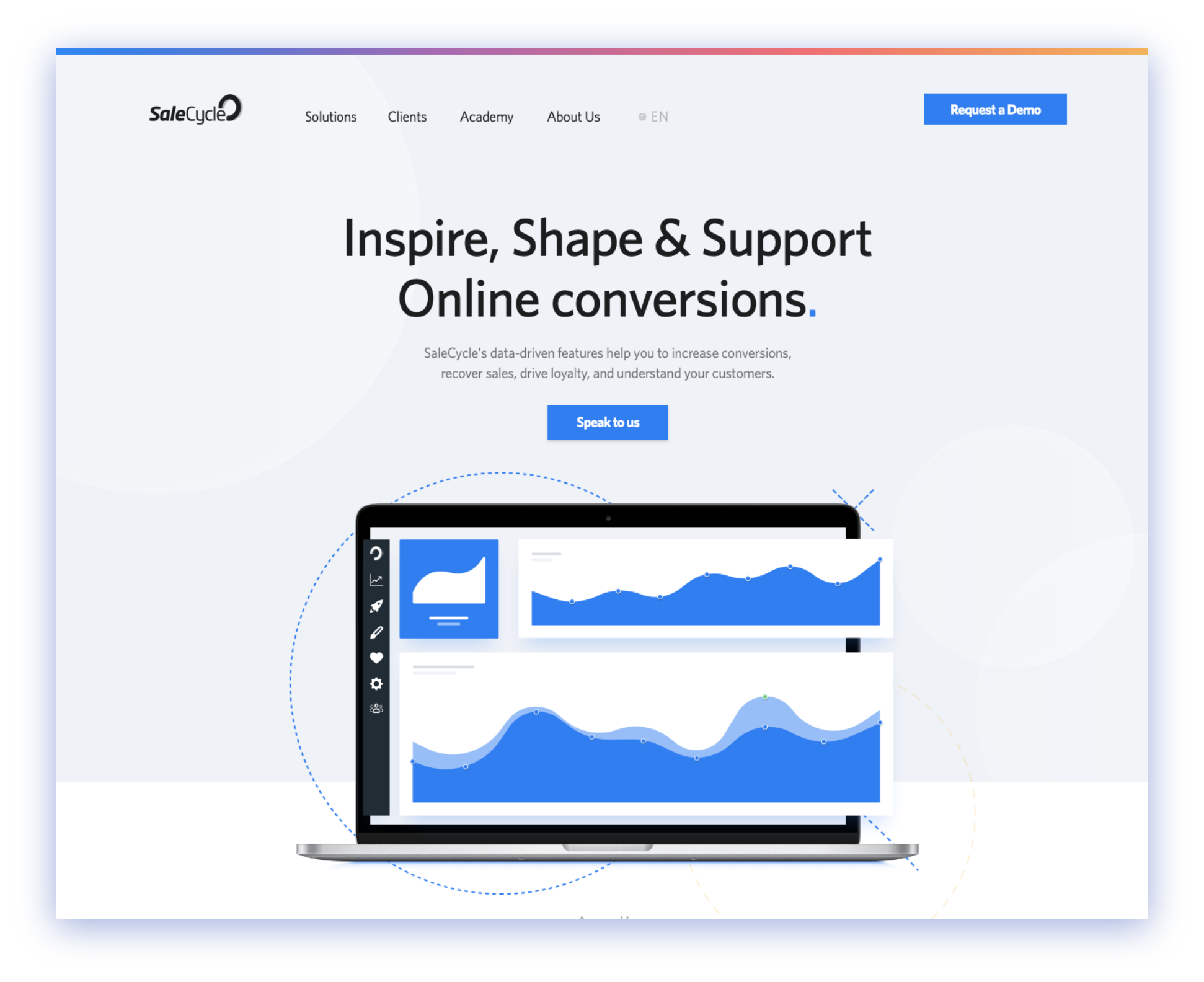
UnderStrap allowed me to rapidly build out the structure of
the website using BootStrap methodology and syntax, but did
not add any unwanted or unused functionality passed that,
giving me the perfect blank slate to work from.
During this stage, a new team lead joined and timelines
changed. This underlying framework built using UnderStrap
was pivotal in meeting goals and the expectations of the
business, and the new SaleCycle site launched October 28th,
2019.
Within days of launching the new site, the increase in traffic to the site was immediately apparent. Bounce rate dropped and active time on page rose.
Alongside this, the key measuring factors into determining whether the new build was a success were as so:
19.8s
Old
1.8s
New
68k
Old
35k
New
7k
Old
18k
New
97.5%
Old
81%
New
17s
Old
51s
New
Overall, while the site design and build is an ongoing success, there are areas to improve and optimise going forward. Integration with Marketing tools like Pardot is only just becoming something that I personally am happy with, opening up potential for streamlining the conversion process with prospective leads.
The key factor in understanding the prime stakeholder's needs before reaching a higher fidelity prototype is something I'll strive to achieve going forward, even when said Stakeholder is much higher up the corporate hierarchy than I.
Finally, while I was pleased with the foundation I created using UnderStrap, there is always room to improve when it comes to development and given more time, it would be likely I'd end up pulling together my own boilerplate to build upon.
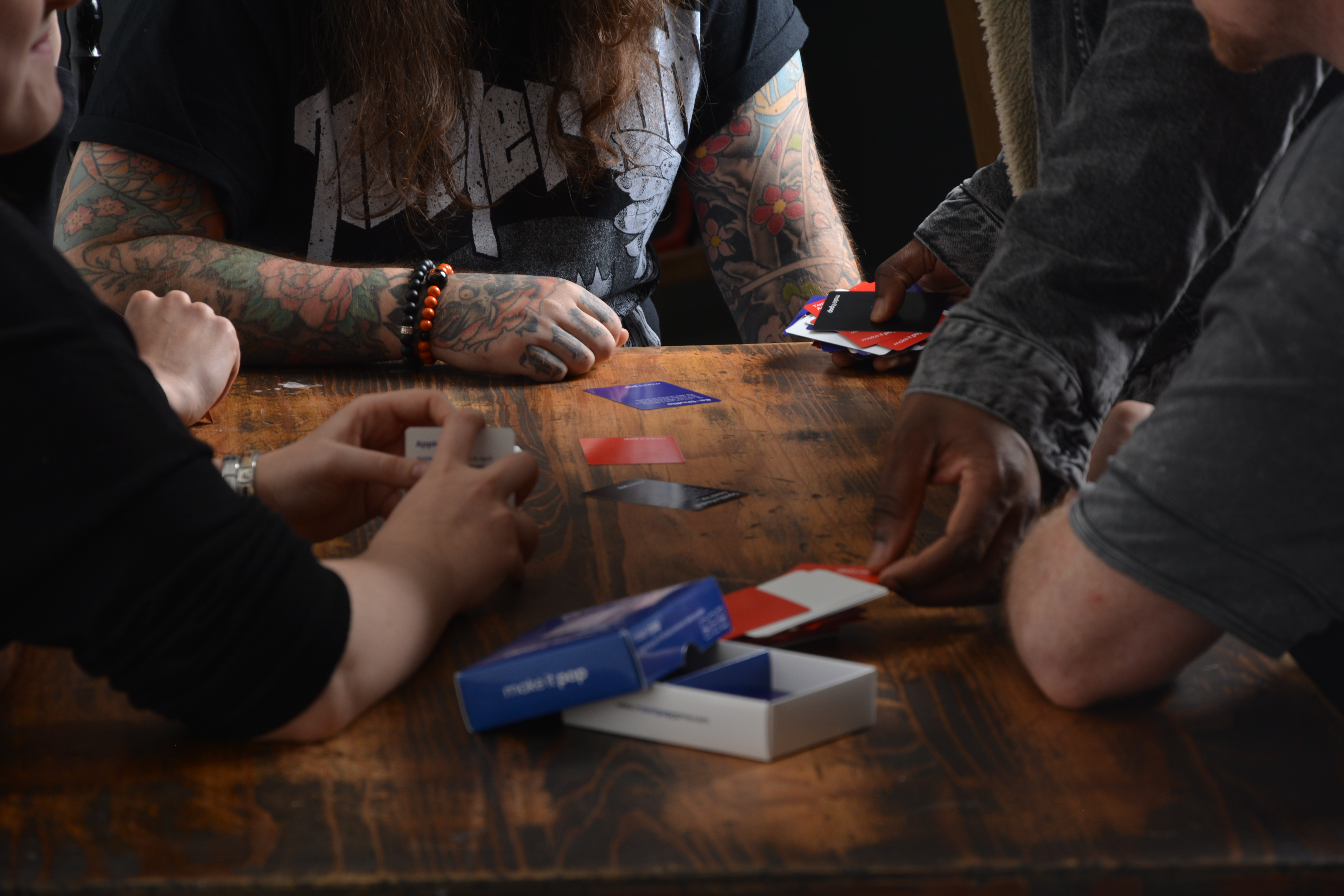
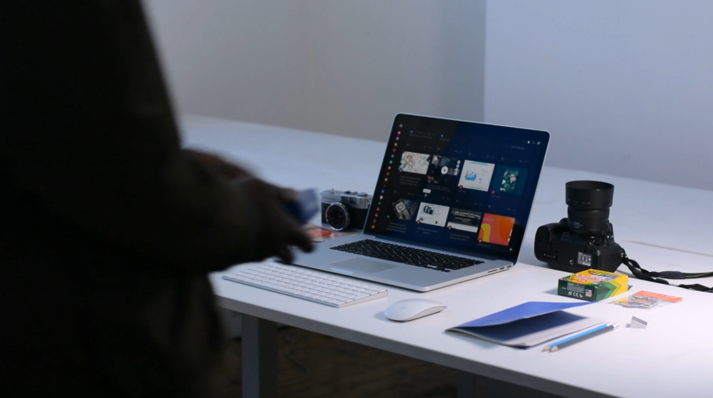
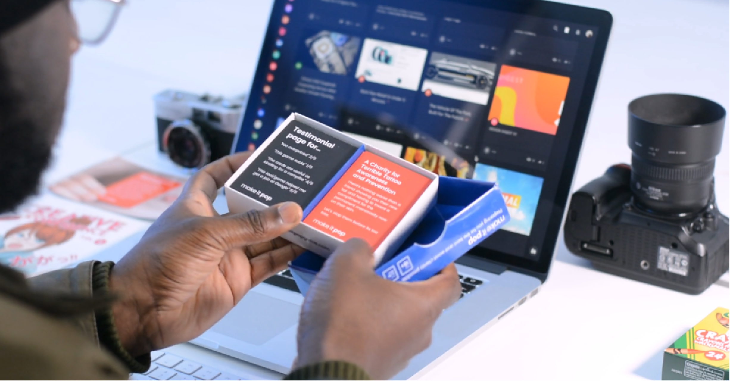
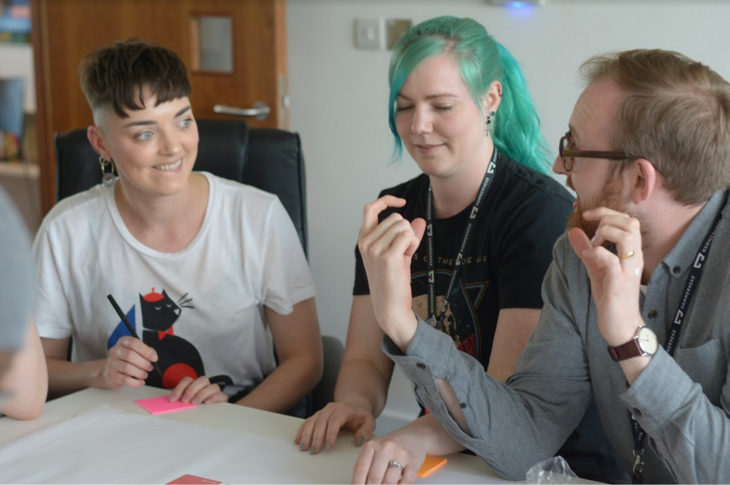
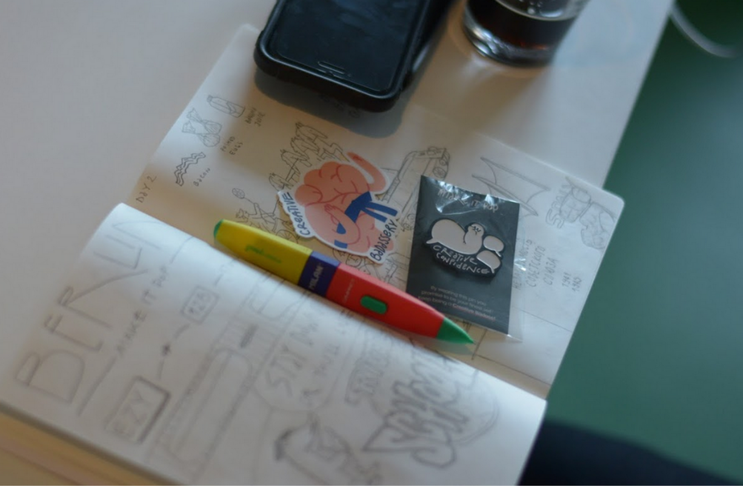
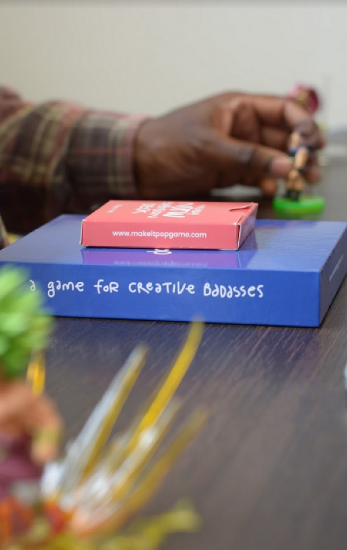
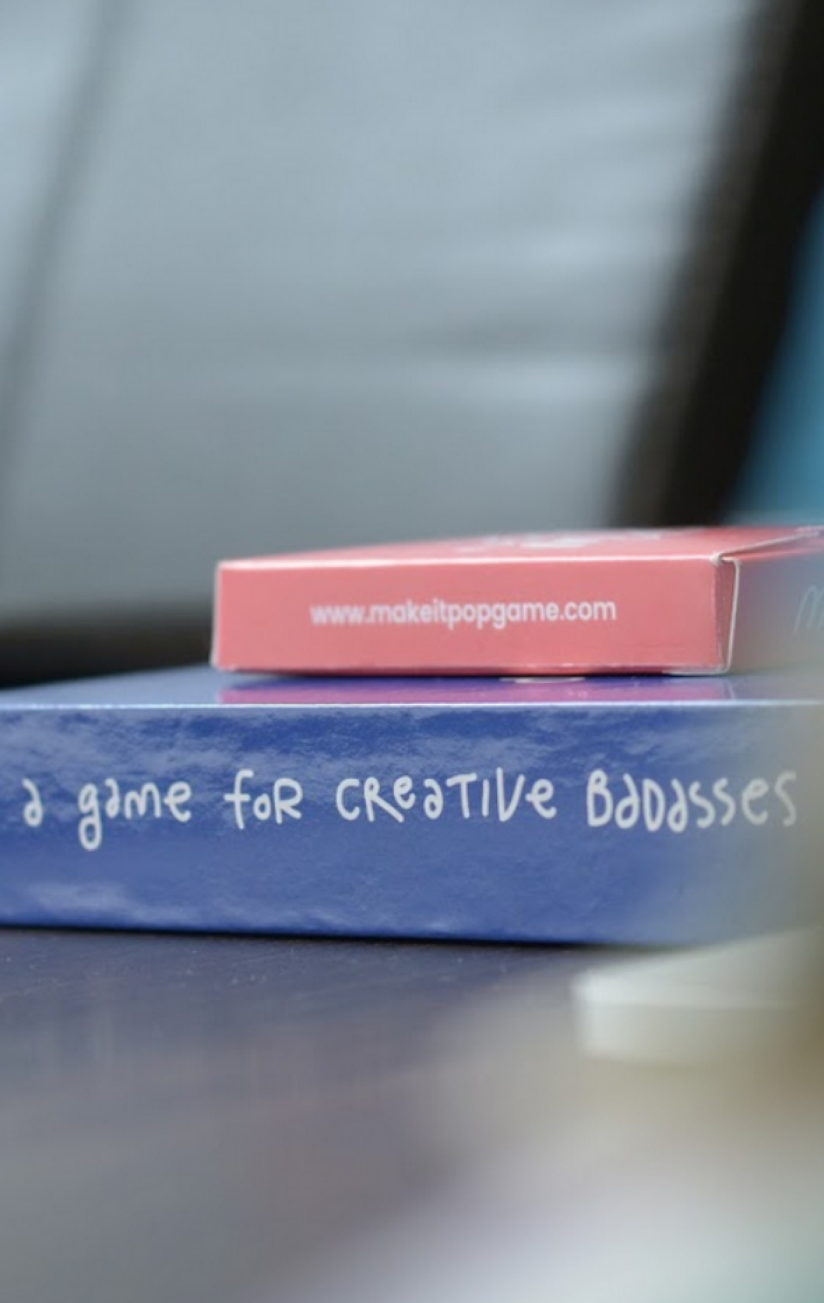
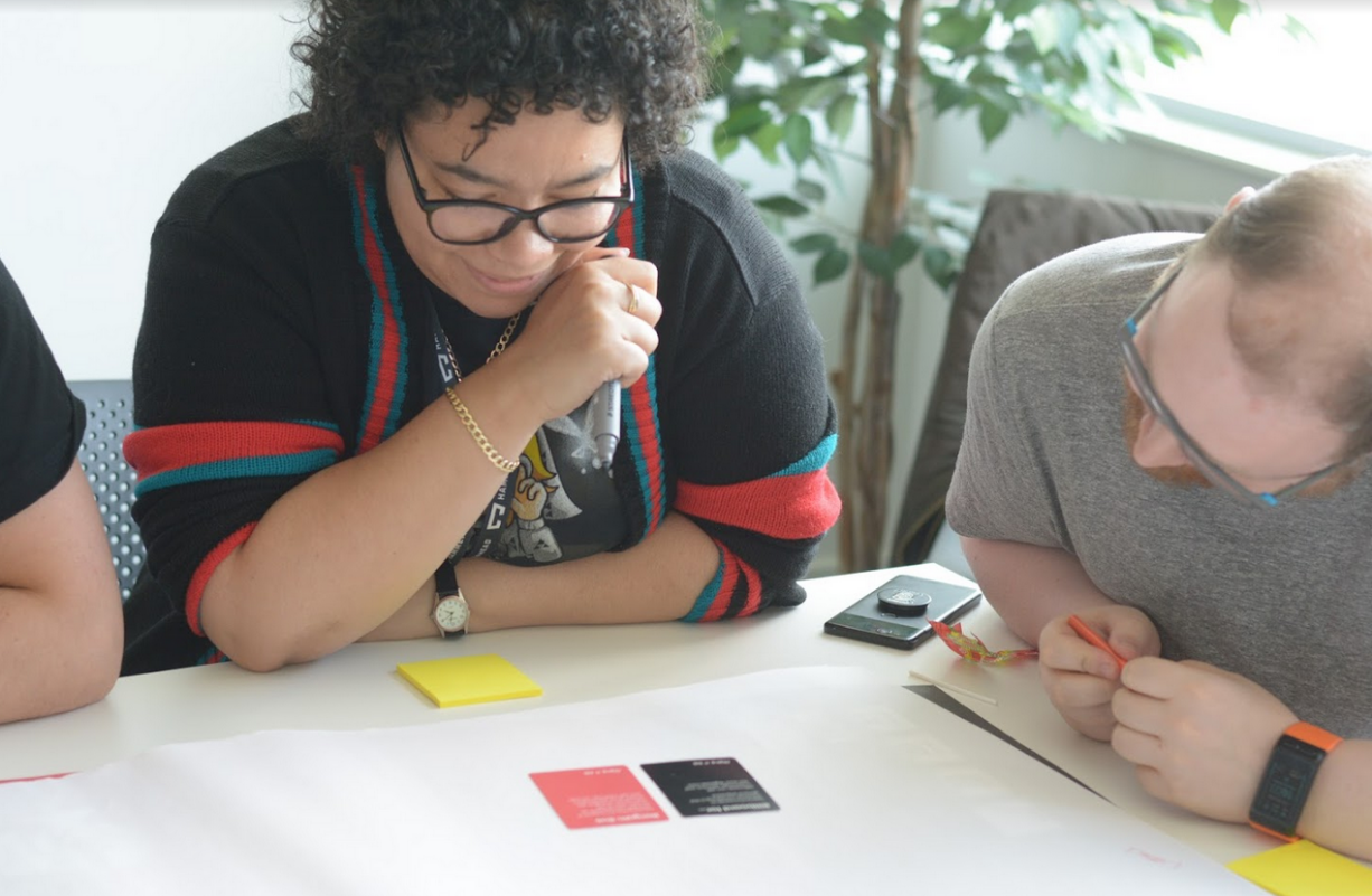
Beginning as a midnight WhatsApp message between friends and spiralling out of controll into a fully fledged product, make it pop has been a passion project of mine for the past 3 years.
Simply put, it's a tool to boot up your design thinking and creative confidence.
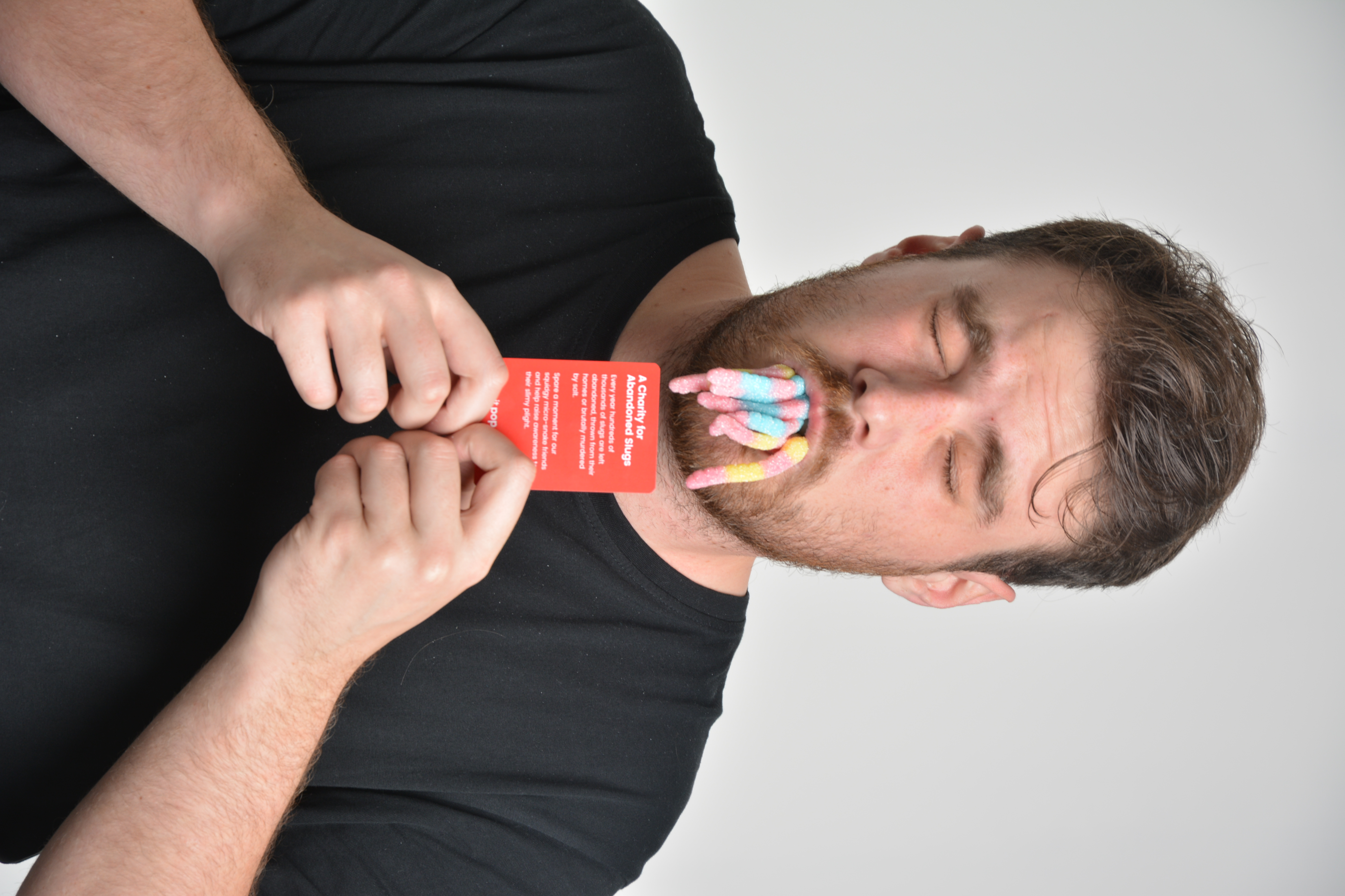
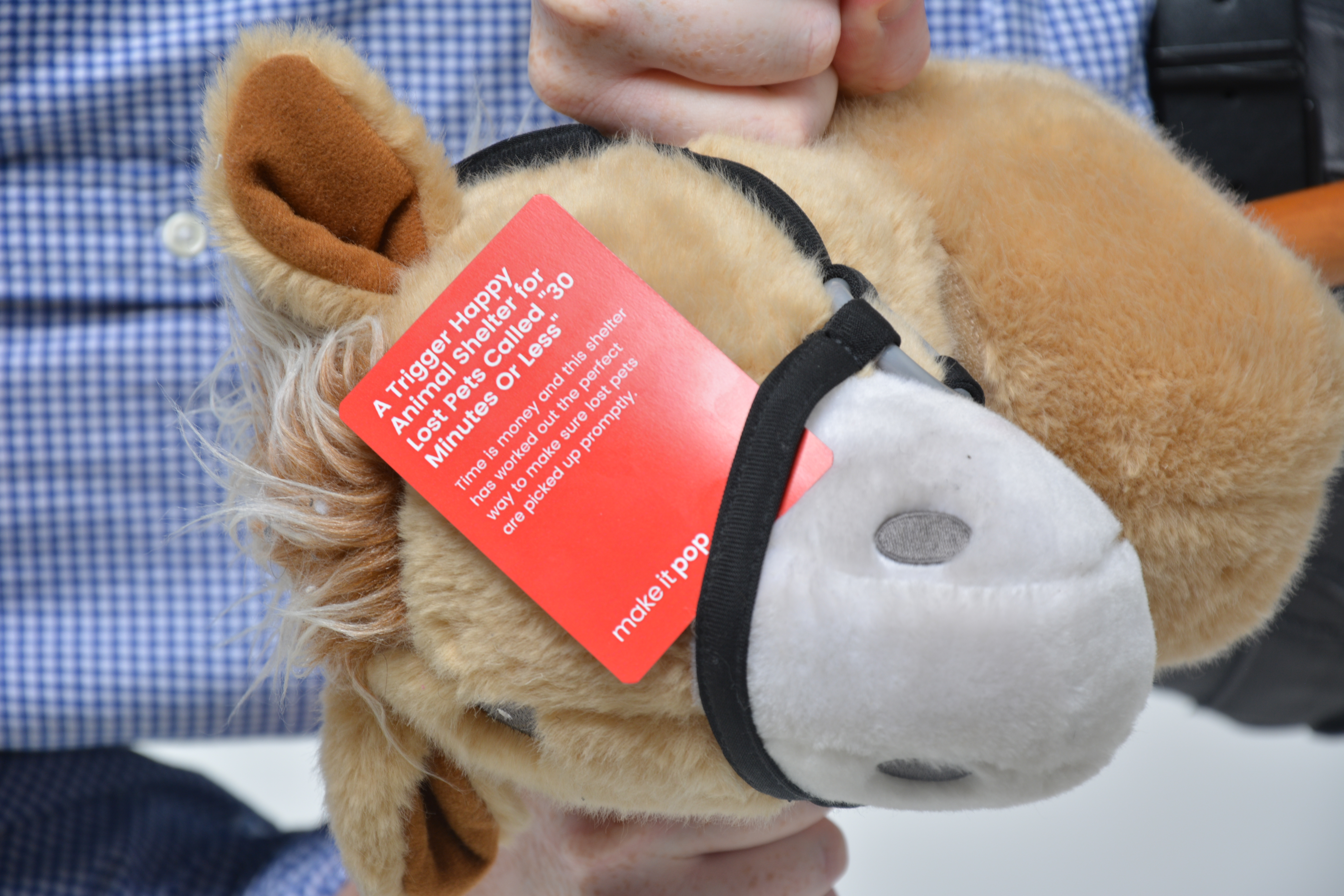
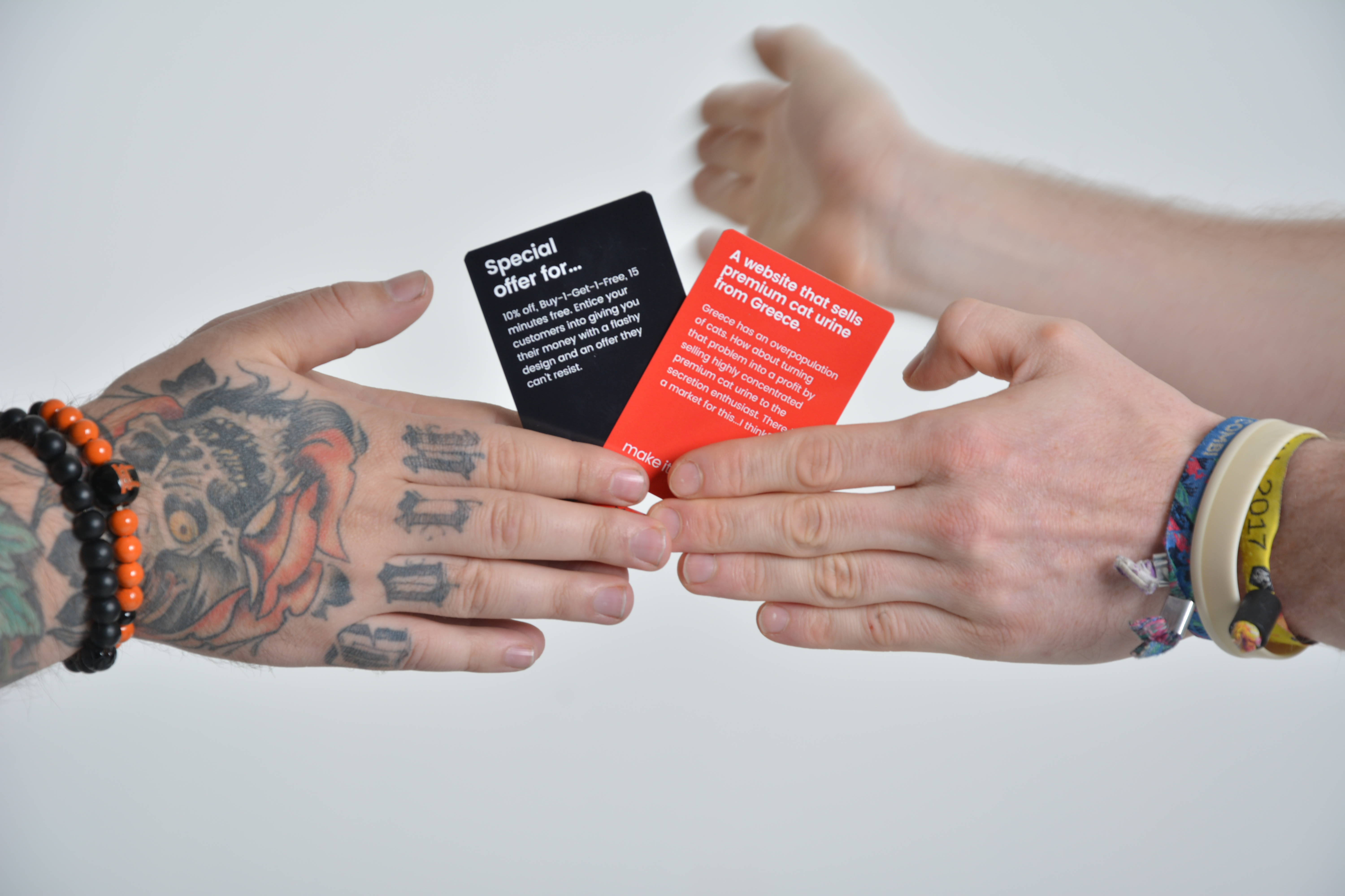
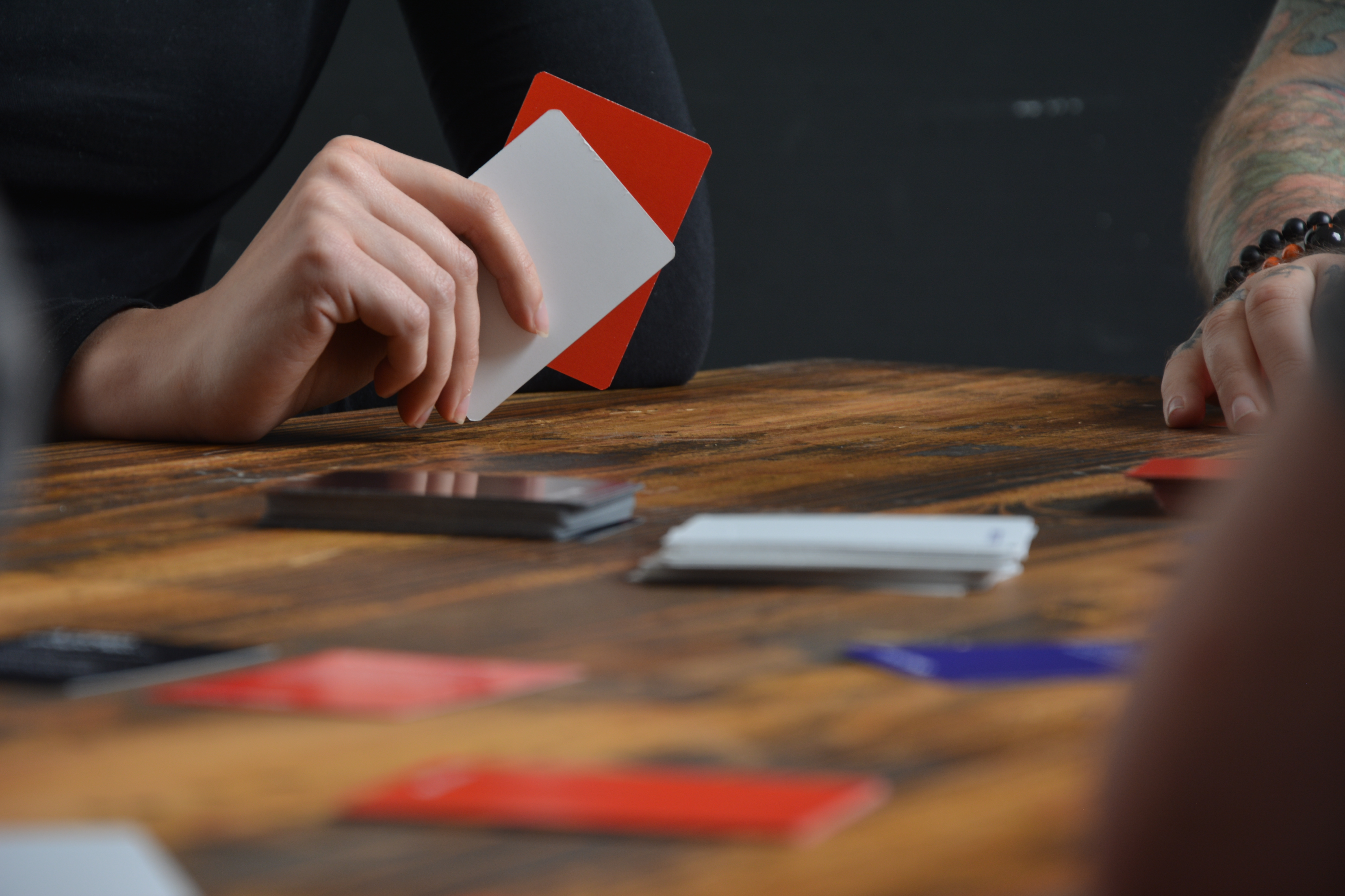
By combining task, client and condition cards, the game creates a brief which players then have to complete. Whether that means designing it digitally, pitching it as a marketing excercise or just sketching it out.
Prior to my life as a Web developer / UX designer / Marketeer, I spent a year working with a local commercial photographer with the aim of taking my hobby to a professional level.
The skills and competencies I learned during this time meant I was well equipped to take over the photography and videography aspect of the product that myself and two friends were trying to create.
From understanding how to use studio equipment to being able to frame a composition to best capture the product, my official title as the 'photovideoperson' was an easy decision.
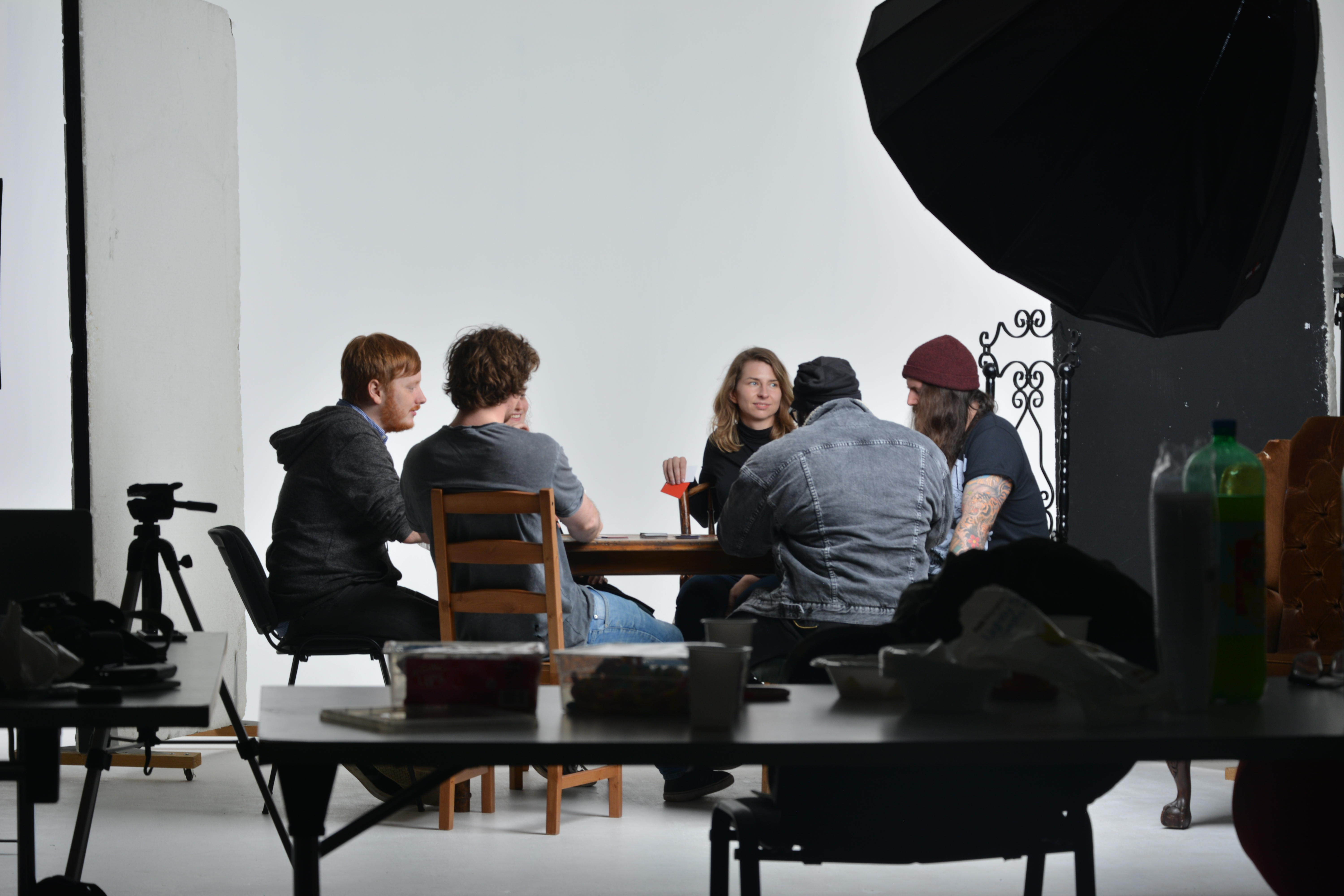
I quickly found out that even with willing participants, confidence in our project and being a key stakeholder myself doesn't always equate to a consisten outcome.
If I was going to create usable imagery that is useable anywhere (which is a massive boon to a fledgeling product), we need to come up with a plan.
Alongside this, the creeping knowledge that we'll soon need a video to unleash onto the kickstarter grew...
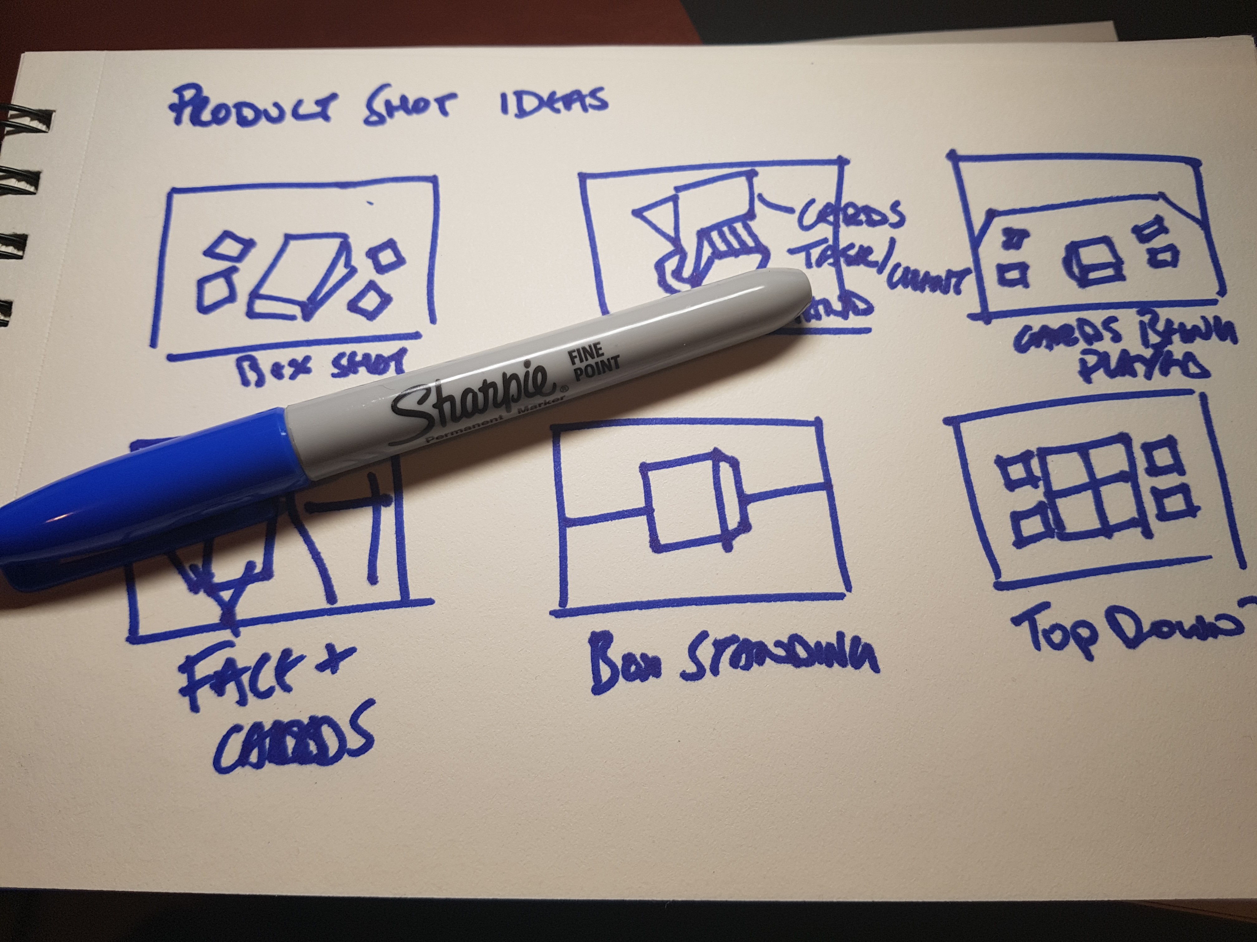
Having set a date, we knew we had to deliver and the clock started ticking. With my new found power in planning photoshoots (seen above), we set out to create the video that would be the foundation of our kickstarter campaign.
And I also started learning more about motion graphics, video editing and audio mastering because 'fake it til you make it' is a strong motivation when you're set a task you feel you're not totally comfortable with and the dreaded imposter syndrome starts to set in.
With the videos created and the product shots taken, the true test in determining whether I created something engaging game when we hit launch on the campaign. We asked for a total of £2,500, with the idea that if we reached that, we'd feel comfortable being able to see our product in the hands of a few friends and colleagues.
Then this happened.
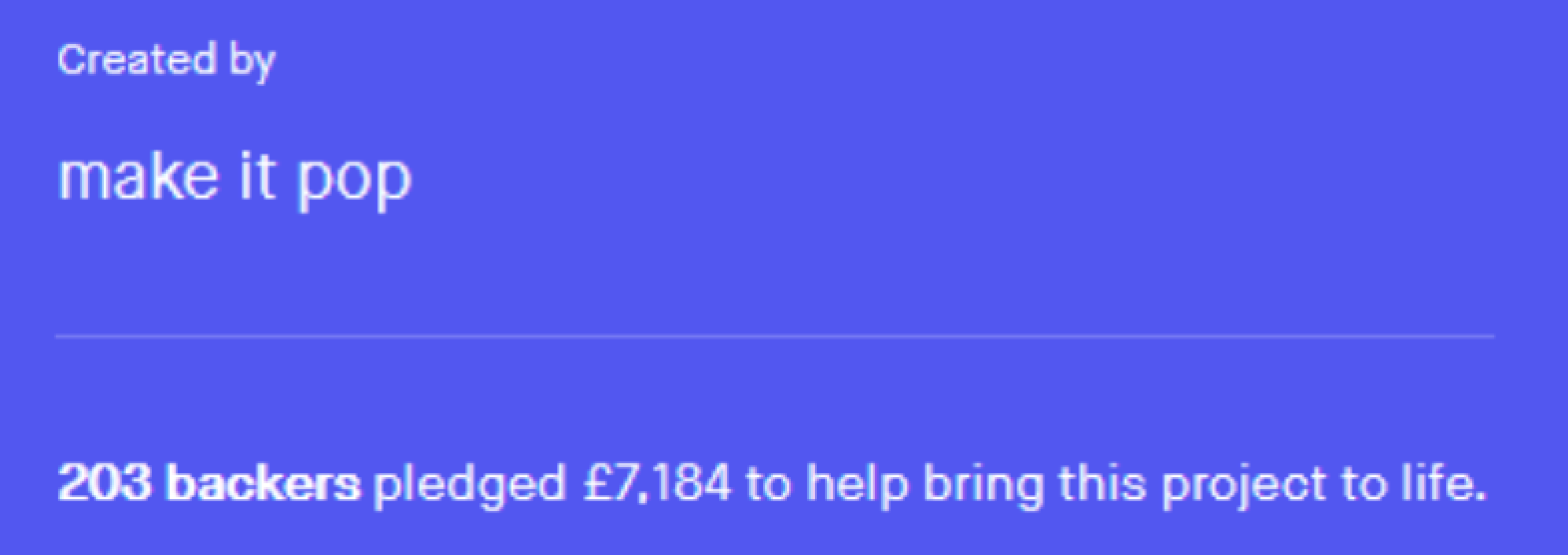
From this point onwards, we had the confidence to know that we had created something special, that my photos and videos had an impact on our success and that we have a tonne more work to do.
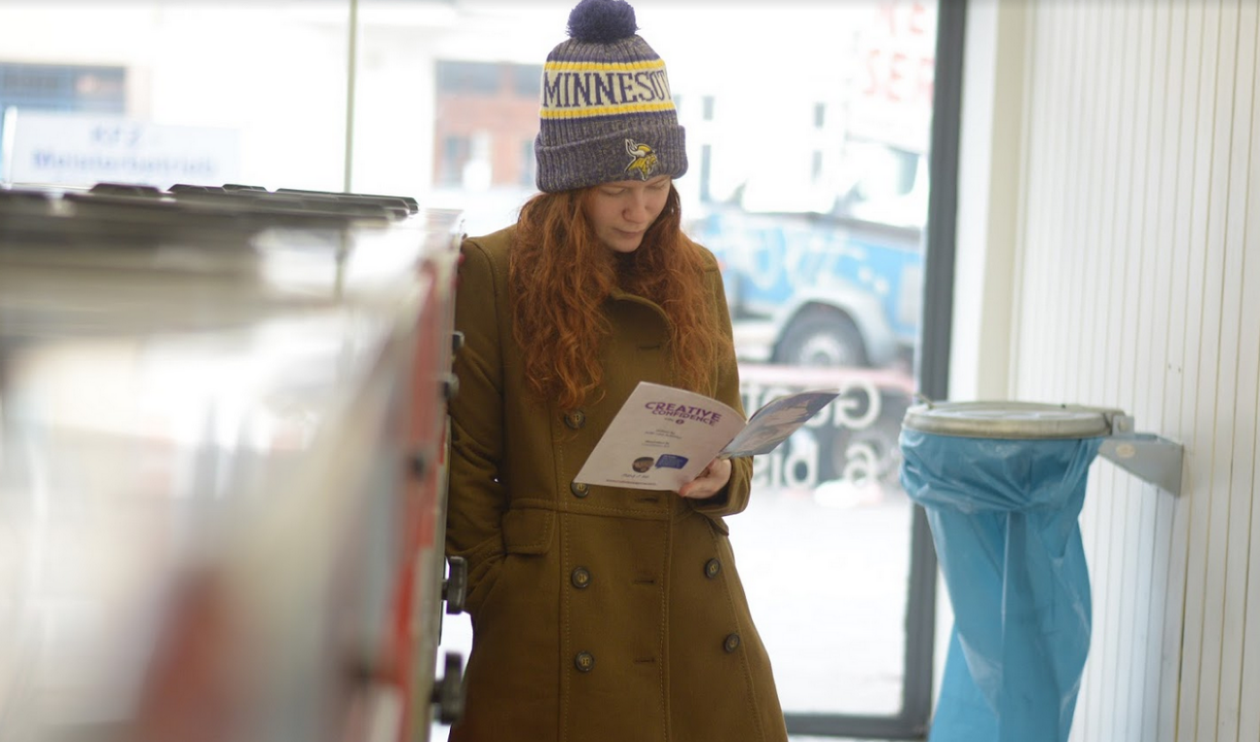
And we're still going. Below are some shots from shoots I've set up, workshops I've photographed and videos we've planned.


With the world at a standstill due to COVID-19, every aspect of society and business was put into forced hibernation. With designers around the world being furloughed and made redundant in droves, we wanted to create something that would give the essence of what make it pop does, for free and with a fun new angle.
Introducing Not Safe For Design, a free creative challenge generator.
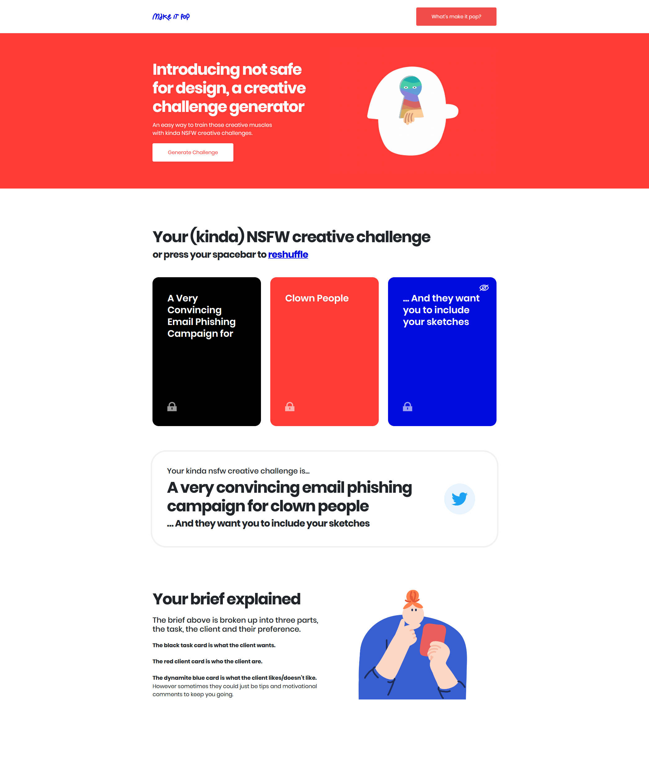
The idea was to create a fast-loading, online version of make it pop that after a user enters the web address, they would immediately have a fully fleshed out brief with research direction and a share function, while allowing easy ability to customise the brief as they see fit.
The layout of the design was built using a 12-column grid, so it seemed obvious to start with a Bootstrap 4 base and work on a jQuery script solution to form the functionality of the web app.
The project ended up being featured on DesignTaxi.com here and made it into productdesign.tip's 'Challenges and Excercises' section here.
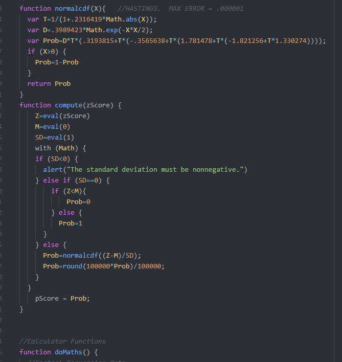
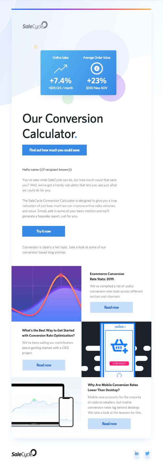
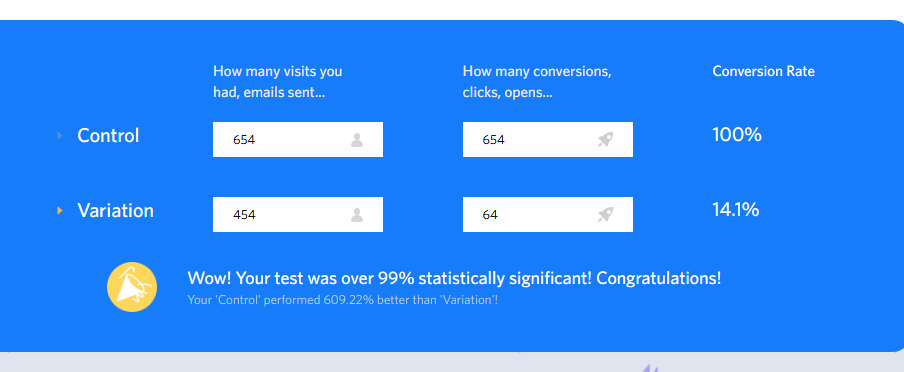
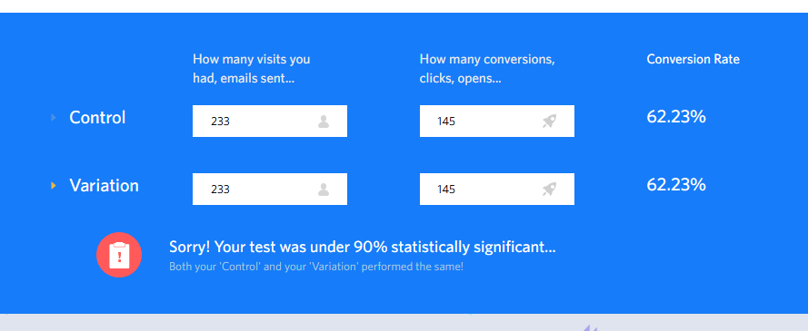
One of my first projects that I worked on when I became the SaleCycle Web Marketing Manager was the Significance Calculator. After transitioning from a role where I predominantly worked with HTML and CSS, I wanted to try my hand at some logic work - an how better to do that than with advanced statistics.
The aim of the project was simple, create a calculator web app that our enterprise clients can use to figure out if their split tests had any statistical significance to determine if they had found a true winner. Being my first real foray into scratch building something with only an amateur level knowledge, I set out on my task.
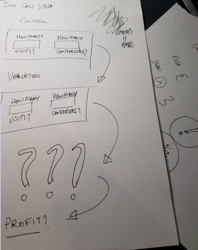
After a tonne of time talking about formulae way beyond my then mathematical ability with the in-house data team, I came up with the design below.
The idea from a functional point of view was that the results would be shown instantly, rather than clicking a 'Submit' button. My thoughts on this were that the user would generally alter their results to figure out how close or far away they were from their own benchmarks.
When it comes to learning a new coding language, I feel the best way to start to feel comforatble with it is to jump into the deep end and start building something completely out of your comfort zone, even if it's something way beyond your current scope.
While my code was rough, the outcome I achieved is something that's still in daily use in the business today.